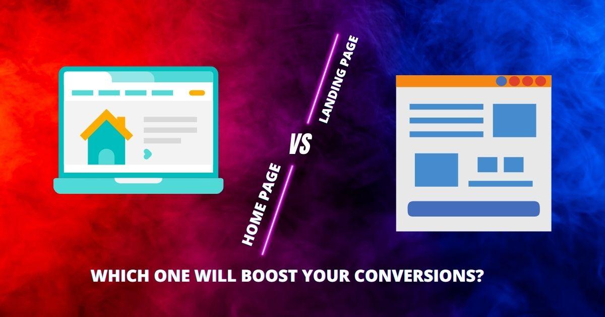
As a author, I have come across various terms related to website design and optimization. One of the most important concepts that every business owner should understand is the difference between a home page and a landing page. A home page is the main page of a website that provides an overview of your business, while a landing page is specifically designed to focus on a particular offer or campaign.
Key Takeaways
- Home pages provide an overview of your business, while landing pages focus on a specific offer or campaign.
- Clear messaging is crucial for home pages, while strong calls-to-action are essential for landing pages.
- Design plays a significant role in both home pages and landing pages.
- A/B testing can help optimize both home pages and landing pages for conversions.
- Choosing the right page for your business goals is key to boosting conversions.
The Purpose of a Home Page: Providing an Overview of Your Business
A home page serves as the virtual front door to your business. It is often the first impression that visitors have when they land on your website, so it’s crucial to make it count. A good home page should provide visitors with a clear message about what your business offers and why they should choose you over competitors.
To achieve this, there are several elements that need to be considered when designing a home page. Firstly, having concise and compelling copy is essential in conveying your message effectively. Visitors should be able to understand what you do within seconds of landing on your home page.
Additionally, incorporating visually appealing graphics or images can help capture visitors’ attention and make them more likely to explore further into your website. An organized layout with easy navigation also contributes to creating an engaging user experience.
The Purpose of a Landing Page: Focusing on a Specific Offer or Campaign
While the purpose of a home page is to provide an overview, landing pages are designed with one specific goal in mind – conversions! Whether it’s signing up for newsletters, purchasing products/services, or downloading resources, landing pages aim at driving action from visitors through strong call-to-action (CTA) statements.
To create effective landing pages, it’s crucial to have clear messaging that aligns with the offer or campaign you’re promoting. This means focusing on highlighting key benefits rather than overwhelming visitors with excessive information.
Furthermore, incorporating a strong CTA is essential in guiding visitors towards the desired action. A well-crafted CTA should be attention-grabbing, persuasive, and easy to follow. It’s important to remember that visitors have a short attention span, so making the CTA stand out is crucial for conversions.
The Importance of Clear Messaging on a Home Page
| Metrics | Description |
|---|---|
| Bounce Rate | The percentage of visitors who leave the website after viewing only one page due to unclear messaging. |
| Conversion Rate | The percentage of visitors who take a desired action on the website, such as making a purchase or filling out a form, due to clear messaging. |
| Time on Page | The amount of time visitors spend on the home page due to engaging and clear messaging. |
| Brand Perception | The way visitors perceive the brand based on the messaging on the home page. |
| User Experience | The ease with which visitors can navigate and understand the website due to clear messaging. |
Clear messaging on a home page is vital for capturing visitors’ attention and conveying your business’s value proposition effectively. When crafting your message, it’s important to keep it concise and avoid using jargon or complex language that may confuse or alienate potential customers.
To create clear messaging, I often recommend starting with a strong headline that immediately communicates what your business offers. This should be followed by supporting subheadings or bullet points that highlight key features or benefits.
In my experience as an author, I’ve found that incorporating personal anecdotes can also help make the message more relatable and memorable. Sharing stories about how your product/service has positively impacted customers can build trust and credibility.
The Importance of a Strong Call-to-Action on a Landing Page
A landing page without a strong call-to-action (CTA) is like having an unfinished story – it leaves visitors hanging without clear guidance on what they should do next. A compelling CTA not only encourages visitors to take action but also increases the chances of conversions.
When creating a strong CTA for your landing page, it’s important to use action-oriented language that creates urgency and excitement. For example, instead of using generic phrases like “Learn More,” try using statements like “Get Your Free Trial Now” or “Limited Time Offer – Buy Today!”
Additionally, incorporating visual cues such as arrows or buttons can help draw attention to the CTA and make it more clickable. It’s also beneficial to place the CTA above-the-fold so that visitors don’t have to scroll down before taking action.
The Role of Design in Home Pages and Landing Pages
Design plays a crucial role in both home pages and landing pages. A well-designed website not only enhances the overall user experience but also contributes to building trust and credibility.
In terms of home page design, it’s important to create a visually appealing layout that is easy to navigate. This includes using consistent branding elements such as colors, fonts, and imagery throughout the page. Incorporating high-quality images or videos can also help capture visitors’ attention and make your business more memorable.
When it comes to landing page design, simplicity is key. A clutter-free layout with minimal distractions allows visitors to focus solely on the offer or campaign you’re promoting. Using contrasting colors for the CTA button can make it stand out and increase click-through rates.
The Benefits of A/B Testing for Home Pages and Landing Pages
A/B testing is a valuable tool that allows businesses to compare two versions of a webpage (A and B) to determine which one performs better in terms of conversions. By conducting A/B tests on both home pages and landing pages, you can gather data-driven insights that help optimize your website for maximum results.
The benefits of A/B testing are numerous. Firstly, it helps identify areas where improvements can be made by comparing different elements such as headlines, copywriting styles, layouts, or CTAs. This data-driven approach eliminates guesswork and ensures that changes made are based on actual user preferences.
Secondly, A/B testing provides valuable insights into visitor behavior patterns by tracking metrics such as bounce rates or time spent on page variations. This information helps understand how users interact with different elements on your website so that you can make informed decisions about what works best for your target audience.
How to Optimize Your Home Page for Conversions
Optimizing your home page for conversions involves implementing strategies aimed at increasing engagement levels with visitors while encouraging them to take action. Here are some tips to help you get started:
1. Streamline your message: Ensure that your headline and subheadings clearly communicate the value proposition of your business.
2. Use compelling visuals: Incorporate high-quality images or videos that resonate with your target audience and support your messaging.
3. Simplify navigation: Make it easy for visitors to find what they’re looking for by organizing content into logical sections and using intuitive menus.
4. Include social proof: Display testimonials, reviews, or case studies to build trust and credibility with potential customers.
5. Optimize for mobile devices: With the increasing use of smartphones, it’s crucial to ensure that your home page is mobile-friendly and loads quickly on all devices.
How to Optimize Your Landing Page for Conversions
Optimizing landing pages requires a different approach compared to home pages since the primary goal is conversions rather than providing an overview of your business. Here are some tips to optimize your landing page:
1. Keep it focused: Remove any unnecessary distractions or links that may divert visitors’ attention away from the main offer or campaign.
2. Create a sense of urgency: Use time-limited offers or limited stock availability statements to create a sense of urgency and encourage immediate action.
3. Test different CTAs: Experiment with various CTA styles, colors, sizes, or placements to determine which ones generate higher conversion rates.
4. Minimize form fields: Only ask for essential information in forms as lengthy forms can deter visitors from completing them.
5. Provide clear benefits: Highlight key benefits in bullet points or short paragraphs so that visitors understand what they will gain by taking action.
Examples of Effective Home Pages and Landing Pages
To illustrate the concepts discussed above, let’s take a look at some real-life examples of effective home pages and landing pages:
Home Page Example:
One example I came across recently is Apple’s home page (www.apple.com). The headline “Say hello to the future” immediately captures attention and creates curiosity. The page features stunning visuals of their latest products, accompanied by concise copy that highlights key features and benefits. The navigation is simple and intuitive, allowing visitors to explore different product categories effortlessly.
Landing Page Example:
A great example of an effective landing page is from Dropbox (www.dropbox.com/business). The headline “Work better together” clearly communicates the value proposition of their business solution. The page focuses on highlighting key benefits through concise copy and visually appealing graphics. The CTA button “Try free for 30 days” stands out with a contrasting color, creating a sense of urgency.
Conclusion: Choosing the Right Page for Your Business Goals
In conclusion, understanding the difference between a home page and a landing page is crucial for optimizing your website’s performance. While home pages provide an overview of your business, landing pages focus on specific offers or campaigns with strong CTAs.
By incorporating clear messaging, strong CTAs, well-thought-out design elements, A/B testing strategies, and optimization techniques discussed above, you can boost conversions on both your home pages and landing pages.
When choosing between a home page or landing page for your business goals, it’s important to consider factors such as the nature of your offer or campaign and what action you want visitors to take. Aligning your webpages with your overall business objectives will ensure that you create engaging experiences that drive results.
In my experience as an author specializing in digital marketing strategies, I have witnessed firsthand how implementing these principles can significantly impact conversions rates. By investing time in understanding these concepts and applying them effectively to your website design process, you can set yourself up for success in today’s competitive online landscape.
Incorporating elements such as clear call-to-action buttons, user-friendly navigation, compelling visuals, and engaging content can make a substantial difference in how visitors interact with your site and ultimately lead to higher conversion rates. Additionally, utilizing data analytics to track user behavior and make informed decisions for optimization can further enhance the effectiveness of your digital marketing efforts. By staying informed about the latest trends and continuously refining your strategies, you can stay ahead of the curve and drive meaningful results for your business.
FAQs
What is a home page?
A home page is the main page of a website that serves as an entry point for visitors. It typically includes a navigation menu, links to important pages, and an overview of the website’s content.
What is a landing page?
A landing page is a standalone web page designed to convert visitors into leads or customers. It is usually created for a specific marketing campaign and has a clear call-to-action.
What is the difference between a home page and a landing page?
A home page is a general overview of a website, while a landing page is designed for a specific purpose, such as lead generation or product promotion. A home page typically has multiple links and options for visitors, while a landing page has a single call-to-action.
Which one is better for conversions, a home page or a landing page?
A landing page is generally better for conversions because it is designed with a specific goal in mind and has a clear call-to-action. A home page can be distracting and overwhelming for visitors, making it harder to convert them into leads or customers.
When should I use a home page instead of a landing page?
A home page is appropriate when you want to provide visitors with a general overview of your website and its content. It is also useful for visitors who are not yet ready to make a purchase or take a specific action.
When should I use a landing page instead of a home page?
A landing page is appropriate when you want to promote a specific product or service, generate leads, or encourage visitors to take a specific action. It is also useful for visitors who are already familiar with your brand and are ready to make a purchase or take a specific action.
Thank you for reading! Share your experiences and questions in the comments below!


